Cover Page Blog Post #2
In this blog post, I will talk about the planning process of the cover, the creative process, pictures of the production, sense of branding, and my use of digital creative tools.
My planning for the cover was standard-procedure.
As can be seen, most of everything that I planned to do for my cover ended up in the final product. I feel the cover was probably the easiest to plan compared to the feature spread and table of contents pages.
For the story board/mood board, I feel back then it seemed as though it was more music/instrument oriented, and it was all over the place in the sense that there was no clear genre of music I was showing, artists, etc.
In the mood board, I have artists like Drake and A$AP Rocky (contemporary rap/hip-hop), Tupac (classic hip-hop/rap), Stevie Wonder (R&B), Paul McCartney (Rock), etc. Now that I designed my actual magazine, I focused on one genre that I am familiar with (Latin Music/Artists) and also incorporated the gossip aspect of Rolling Stone magazine, which I researched.
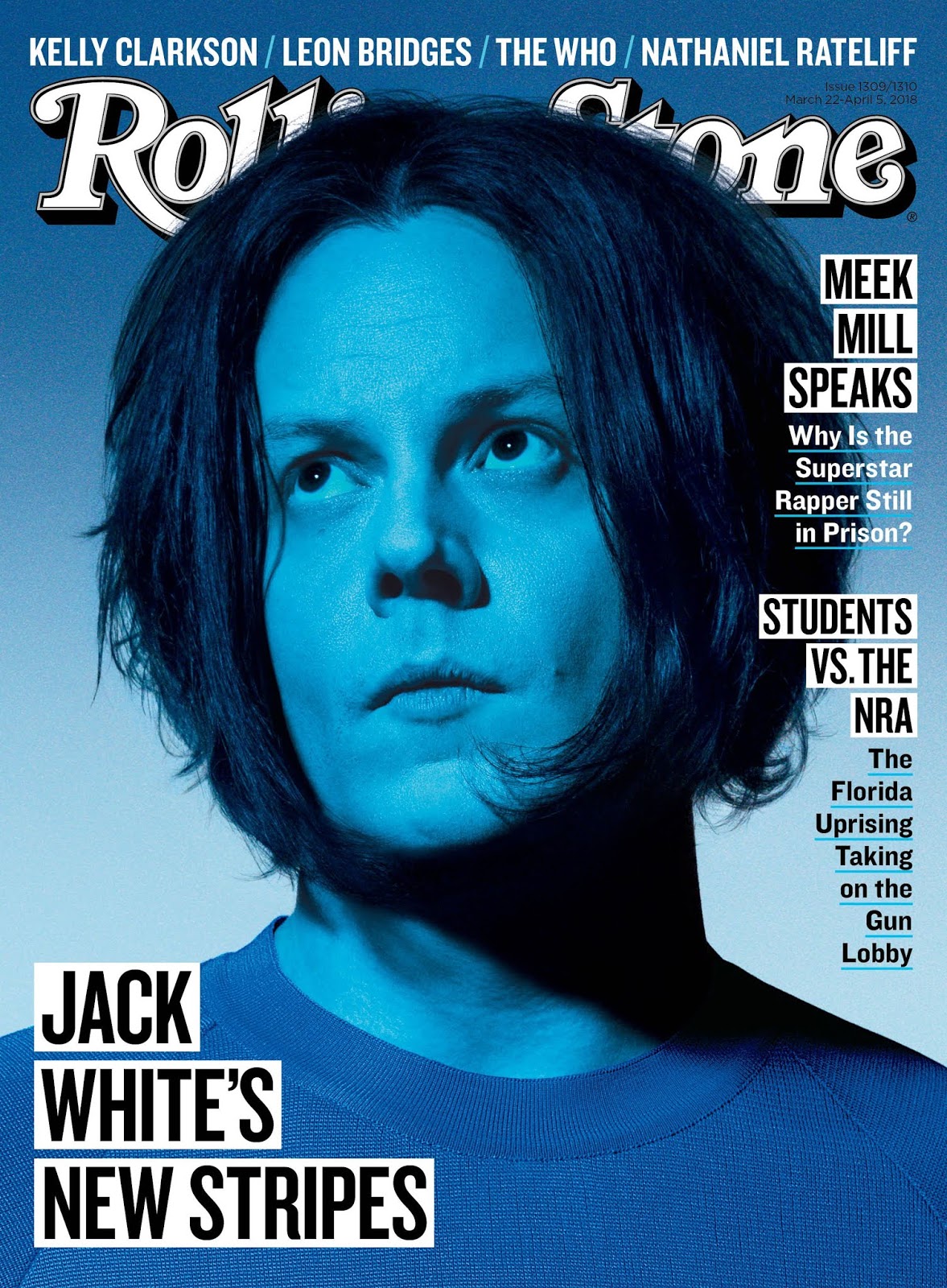
The decision and revision-making of the creative process was something which I was not prepared for. I did not know how much I would actually have to go back and edit after I "thought" I was done. One example was that after I had "finished" the cover, I noticed I initially had not incorporated ANY of my research of the 3 Rolling Stones magazines. Here is the first cover that I initially made which took me hours to create:
It looks nothing like the final product and literally has none of what I had researched. It has no dateline, The Main Cover Line is in the middle arched upwards, the other cover lines run along the bottom, the drawings of Anuel AA and Karol G are just placed there and the amount of close up is not accounted for, etc. Clearly, I started from scratch and actually delved deep into my research. Ultimately, I arrived at the final product after days of hard work.
As for the journey of the creation of the magazine, I have one picture of me creating one the drawings which is the main image on the cover. It is the Anuel AA picture. It shows the tracing process which I learned from this video: https://www.youtube.com/watch?v=FRjUKijmlQM
The photo shows what I learned to do from the video, and also shows that it is my own original work and not a simple cartoon filter on the photo. It also shows me using the bucket tool to fill in patches of open area where I traced, me using the eyedropper tool to get the colors from the original picture, and me using the paint brush tool to fill in more precisely and correct problems with the lips that I traced being erased. I wish I could've recorded myself doing it, though the video would've been more than an hour long, most probably.
For the use of a sense of branding in my final product, I added things such as the + at the end of Latinx+. As can be seen on the cover, this sets it apart and adds distinctiveness to it, since the letter "x" and the ''+'' sign are not only the same font, but the "+" sign is just a rotated "x". It signifies that "we have the inside scoop on things that other magazines don't". Basically, we have MORE (+) to offer.
Aside from that, I also created a sense of branding by having the names of the artists and the flag from their country of origin on the cover. It does not follow the codes/conventions of the magazine that I researched, but again, it helped to create a sense of branding for my own magazine.
As aforementioned, I used a wide variety of digital creative tools to give my drawings their own style. For instance, rather than just have a normal paintbrush and paint the artists like your typical drawings, I used an airbrush tool to give it that soft effect, especially on the edges of the artists' bodies and their surrounding background.


Comments
Post a Comment