Magazine Genre Codes and Conventions Research Project (Cover)
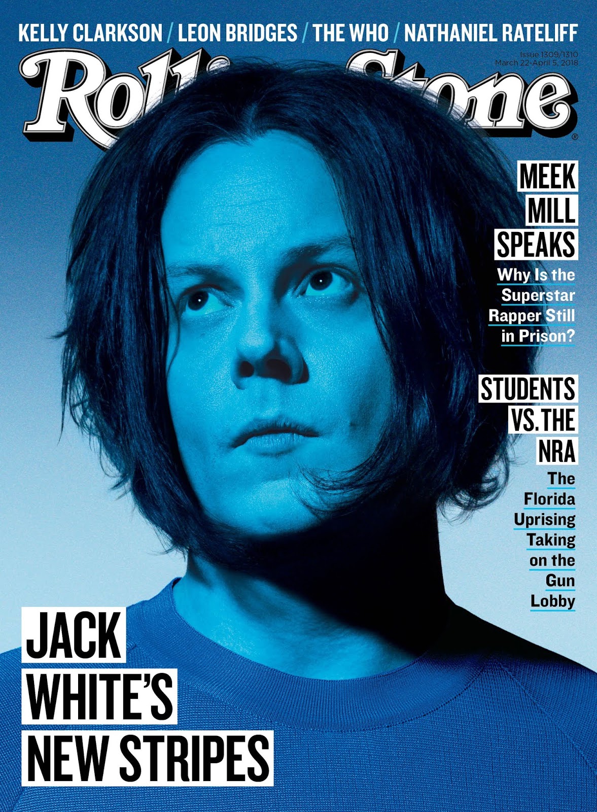


To commence, I chose Rolling Stone magazine, since it was in the same genre as what I plan to make my magazine on (Music Genre). I will be comparing 3 different covers from Rolling Stone today, and will be taking a look at the different aspects of these covers and the codes/conventions that Rolling Stone utilizes to make their magazine truly theirs. My own magazine that I have planned is not that different from Rolling Stone, the only difference being that Rolling Stone not only has artists from a wide variety of genres, but also talks about different topics, like politic, while my magazine will focus exclusively on Hispanic artists and will not venture out into different topics other than music and possibly their lives, so my magazine will resemble the Jack White Rolling Stone Cover (picture above) the most out of the three.
Now, I will discuss basic codes and conventions for Rolling Stone and will be focusing on these 3 magazines. One thing I notice that is consistent throughout these 3 covers is the font of the Masthead, and it is a serif font. I personally find Serif fonts to be more appealing than Sans Serif fonts, which don't have the foot at the bottom of the letters. Therefore, I will most definitely be using a Serif font for my masthead (Name of the magazine). At the same time, however, the color of the actual masthead is what differs between all 3 covers. I understand that Rolling Stone possibly chooses the color once they know the picture to be used, and so I do not think I can really say what color I will make my masthead, though I think a simple white or black will do, since I really like how the Jack White cover came out looking.
Another aspect that differs throughout the 3 covers is the actual shots (for instance, whether it was a close-up shot like Jack White's cover, a medium shot like Justin Trudeau's cover, or a political cartoon like Donald Trump's cover). To be honest, I really like how they used a cartoon for Trump's cover rather than an actual photograph like the other two covers. More likely than not, I will be doing the same thing for my magazine (like a cartoon rendering of a popular Hispanic artist). It is a very interesting concept and this cover gave me that idea.
Some Rolling Stones covers have names of people apart from the subject in the Main Image that are mentioned inside the actual magazine (like on the Jack White cover) on the Top Line. I will definitely be doing something like that on my magazine cover. The Top Line is that single line of text sitting right atop the Masthead (on the Jack White cover only).
The Main Cover Line in the Jack White and Trump covers are both located at the bottom of the magazine (bottom third aligned to the left). I personally see myself doing those rather than the Main Cover Line on Trudeau's cover, which is in the top third/middle third of the cover. In my opinion, placing the Main Cover Line on the bottom (separated from the normal Cover Lines) provides for a much more appealing overall image of the cover, so I will be doing that with mine.
As for the normal Cover Lines (stories that don't have to do with the Main Image), they are the same on all three covers (they're all put to either side of the cover.) However, I do want to experiment with making my Cover Lines lower than as can be seen in the three covers I used (so that it reaches the bottom and doesn't go over, say, Jack White's hair on his Rolling Stone cover).
I will also make my Masthead go behind the subject of the Main Images, as is on all three covers. It's better than having it cover a part of the Main Image.
None of these covers have strap lines, and not having one provides for a much more basic and clean look, and that's what I'm aiming for, so I will omit from having a strap line as well.
The magazines I have observed today helped me realize that even though they all come from the same magazine (Rolling Stone), they can each be very different from one another, whether it is the Masthead's color, the shot of the Main Image, or the positioning of aspects of magazine covers such as the Main Cover Line and Cover Lines.


Comments
Post a Comment