Cover Page Blog Post #1
This is the cover page of my magazine. I used a wide range of techniques to create meaning in it in many ways.
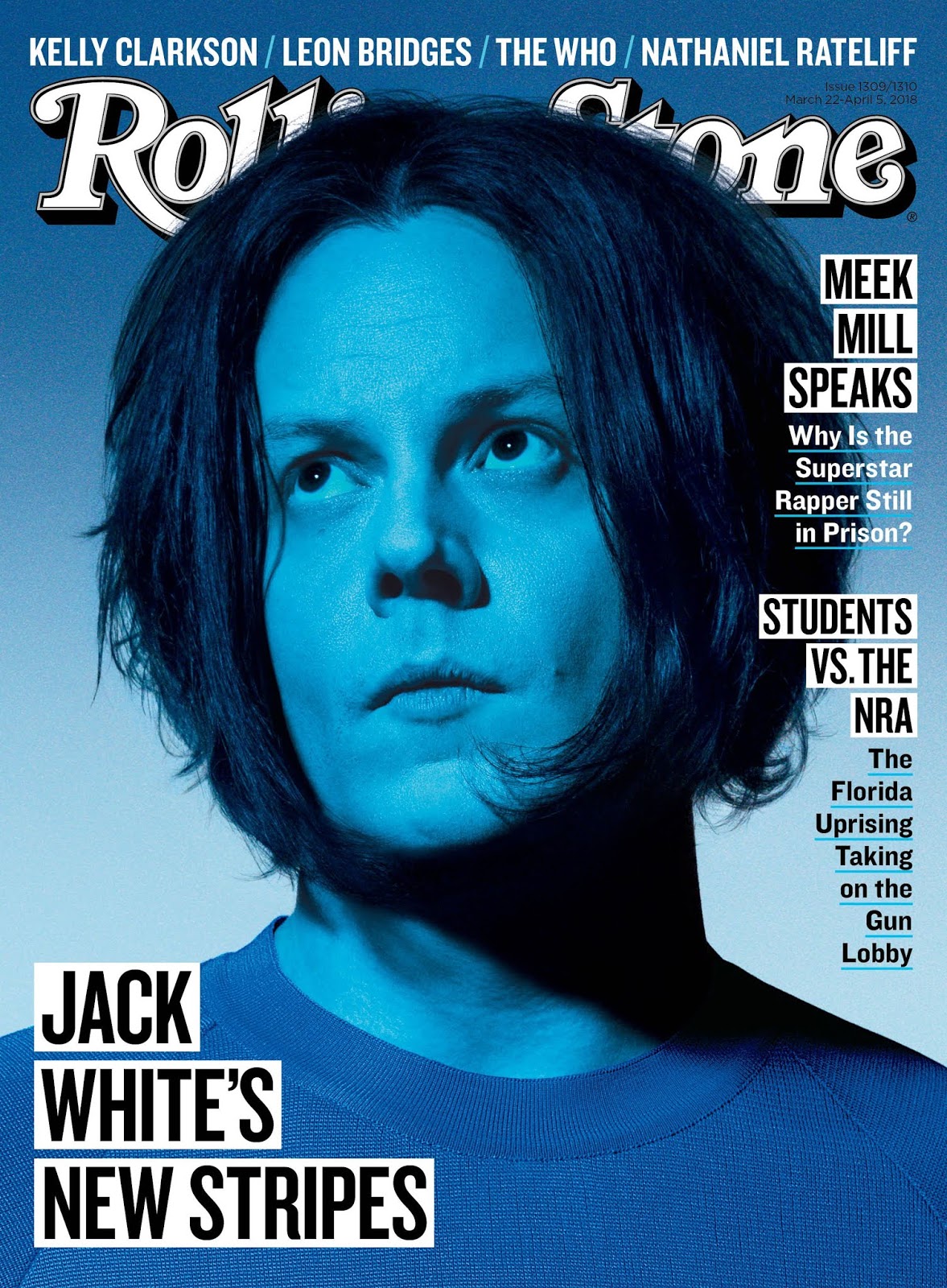
One thing I did for the Main Image(s) is I made sure to use pictures to draw which were either Close Up or Medium shots in order to solely focus on the artists rather than having their whole body and the photo being most of the background, which is what I am not trying to represent. For Karol G (drawing on the top), I did a Close Up to really imply allure, attractiveness, and glamour of the female artist. The drawing encompasses features like her hair, face, eyes, etc, and bears a striking resemblance to the Rolling Stone magazine featuring Jack White's picture on the cover which I researched:
For Anuel AA (drawing on the bottom, under Karol G), I did more of a Medium Shot to show his body language (clearly, the picture doesn't move, but the drawing was from when he was in concert, and his body is kind of in a position where one can tell he was moving, dancing, singing, etc.). This contrasts with the drawing above of Karol G, so in all, that provides 2 different perspectives of both artists for the viewers of this magazine. This drawing of Anuel AA most closely resembles the cover of Rolling Stone's magazine with Justin Trudeau, which is also a Medium shot, and which I also researched.
Another technique I used to create meaning is the split-screen effect to "separate" Anuel AA and Karol G. This shows to the person viewing the magazine (audience) that there is a connection between these two subjects (Anuel AA and Karol G). Another thing I did in InDesign is I did not simply put a line between the subjects. Instead I used the "Directional Feather" Tool in order to provide a seamless transition between both drawings. This conveys unity among both artists on the cover, and the audience can therefore see how these two different people are nevertheless connected and unified.
Now, I will talk about how I conducted research and applied that research in my final product. In fact, I actually already discussed this in my previous paragraphs in this post (in terms of the photos/drawings on my cover and how they relate to the Rolling Stone covers that I researched). However, I will continue to talk about other aspects of research that went into my final product. The name of my magazine (Masthead) is Latinx+. On my magazine cover, I made this white with a black outline, which I saw worked well with the colors in the Jack White Rolling Stone cover. I used this white/black color scheme for my masthead because it is very simplistic, which is what I was aiming for in the first place. Another thing my masthead has which is in all the Rolling Stone covers that I researched is the strong, bold lettering. I really wanted to mimic that as much as possible when researching the Rolling Stone magazines and creating my own magazine cover, since it really pops out on the top of the magazine. I wanted to do the effect that these magazine's have with the masthead going behind the subject's head, but Karol G's head unfortunately covered 90% of the word.
Some important elements which I considered were things such as the selling line and the date line (Publication date). Rolling Stones normally doesn't have a selling line, so I didn't incorporate it into my magazine. However, they had a date line on the top right of the cover MOST OF THE TIME, like on the Justin Trudeau and Jack White covers:
The other Rolling Stone magazine that I researched with a Donald Trump drawing on it had the dateline on the top, centered:
Talking about the Donald Trump Rolling Stone magazine cover, it should be noted that my idea for using drawings of Latin musical artists came from this cover, which is a drawing of Donald Trump, rather than an actual picture.
For the Main Cover Line on my magazine, I was inspired by the Jack White Rolling Stone cover in terms of the style. For instance, on both the Jack White Rolling Stone cover and my cover, the Main Cover Line is on the bottom left. Not only that, but it also is on a white filling and has black lettering. This is also the case for the normal Cover Lines, which also have white filling and black lettering, which again, shows me incorporating the codes/conventions of the magazine.
For the Cover Line, I aligned them to the right of the page like on the Donald Trump and Jack White Rolling Stone magazine covers. I saw that the cover with Justin Trudeau had little divisions separating each cover line story, so I incorporated that feature/element into my cover as well.


Comments
Post a Comment