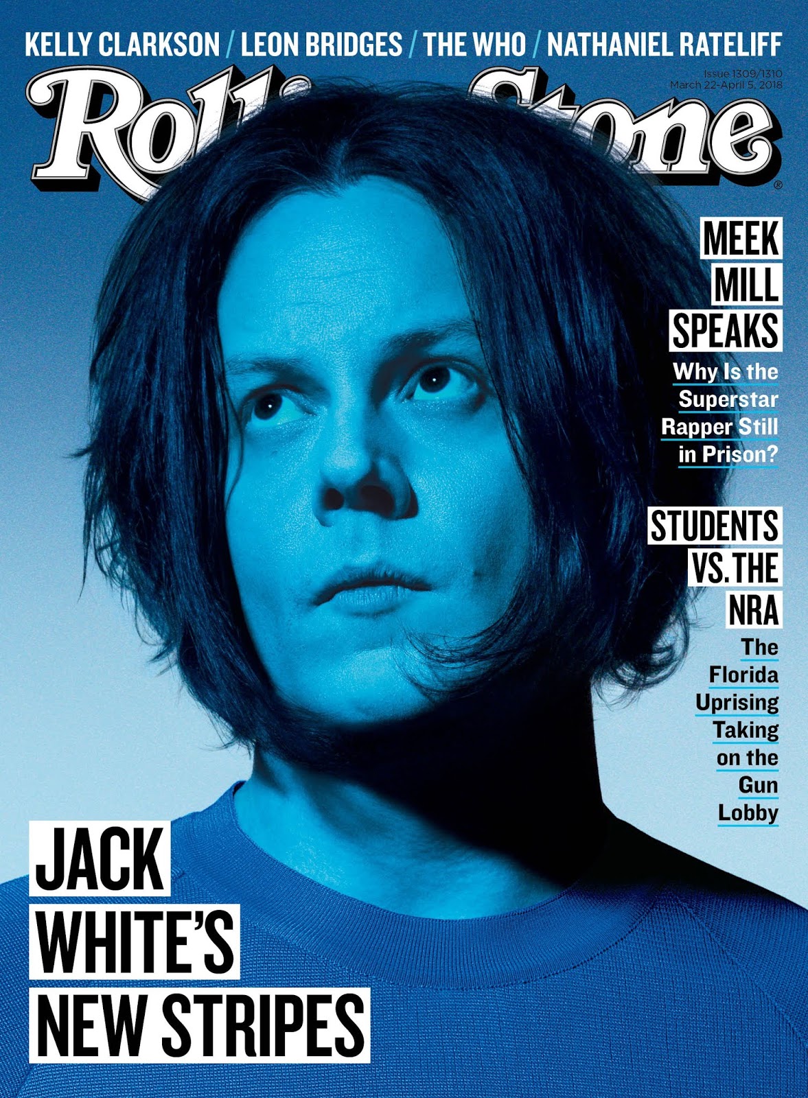
Planning Blog Post #1 - Cover
My magazine's name will be LATINX+. The font used on the cover and pretty much everywhere in the magazine will most likely be Sans Serif (despite what the sketch says), since it is more modern-looking and I feel it will complement the magazine better. My intended/planned colour scheme for the cover is to have the Masthead be a blue colour, with the + at the end being either a darker or lighter shade of blue (for example: LATINX+). As for the rest of the colour scheme (main image, etc.), I do not know that yet since I have not begun taking any pictures or designing the cover page. Since my magazine will talk about Latin American artists, an idea i had for the cover's Main Image is to go to a record store and take a picture of a Latino aisle in the store, or if I am making it artist-specific, then maybe a professional portrait picture of a stack of their albums, etc. There will be no strap line and also no cover line, since I want the magazine to have a basic/simplistic look to it. Main Cover Line will be in the bottom left and the other cover lines will run down along the right side.


Comments
Post a Comment