Magazine Genre Codes and Conventions Research Project (Features)
P.S. I don't know why but i finished this December 6 but it saved as a Draft and not Published. My fault I'm sorry.


Now I will be discussing some of the codes and conventions for the Feature Spread of each Rolling Stone magazine.
Right off the bat, all the feature spreads are laid out across the same two pages (Page 32-33). This is probably so that readers can always know what pages to go to if they wish to see the feature spread.
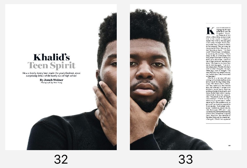
Now we can start to see some differences between the 3 different feature spreads. First and foremost, all of the feature spreads for the magazines are a continuation of the cover of the magazine except for the Justin Trudeau Rolling Stone magazine, which has a feature spread with singer Khalid:


When making my magazine, I probably won't be doing this, and instead my feature spread will reflect what is on the cover of the magazine.
Now, I will discuss the types of images used for each of the feature spreads (camerawork, mise-en-scene) The feature spread with Jack White is a medium-shot of him, and is done to also capture the background (in this case, the background is significant because it is of Detroit, White's home state.)

The feature spread with singer Khalid is a close-up shot to focus on the subject of the photo and the subject only:
As can also be seen, this feature doesn't have a set location (mise-en-scene) like the Khalid feature spread above it. Instead, Khalid's background is just a plain white background.
As for the Donald Trump feature spread, it is a drawing. My magazine will probably feature a drawing too, since I think it is an interesting concept. This feature spread image/drawing is a close-up shot/drawing as well, and the artist did this to focus on Trump's facial expression in the drawing.

Another difference is the font used. However, I wanted to focus more on the design aspect of this, and what I mean is the font size. The Khalid and Jack White feature spreads both have a similar font size, despite having a different font...
...while the Donald Trump feature spread features a much larger font size:
I like the font(s) and font size(s) of the Khalid/Jack White feature spread the most, so I will be using similar ones for my own magazine.
Thus, overall, I prefer the style of the Donald Trump feature spread (drawing, close-up, etc.), though I will keep in mind some things I liked about the two other feature spreads, like the font styles and two-page spread type of look.


Comments
Post a Comment